Data Viz Workshop at MICA
A few weeks ago, Eric and I visited the Maryland Institute College of Art to conduct a weekend workshop with the Graphic Design MFA students. The students were tasked with creating posters to visualize the transcripts of the State of the Union Addresses, from Washington to Obama. The State of the Union is a lens into a changing America and a changing world, giving insight into national priorities over past 200+ years. With the upcoming presidential elections, we thought this was a timely topic and an opportunity to get thinking about the role of a designer in shaping political conversation.
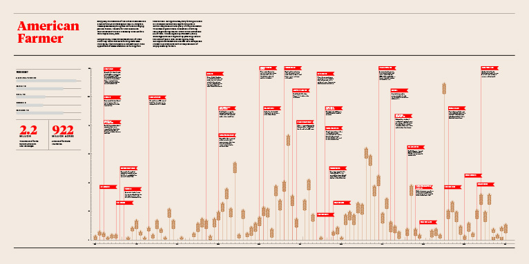
We were interested to see how the students would approach the challenge of working with a body of text as data. Some students used the entire corpus of transcripts, but others narrowed their focus to a cross-section of data to create a purposeful narrative. The State of the Union transcripts were the core material for the visualizations, but many chose to pair them with additional data, like relevant historical events or legislation.
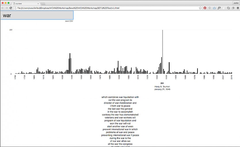
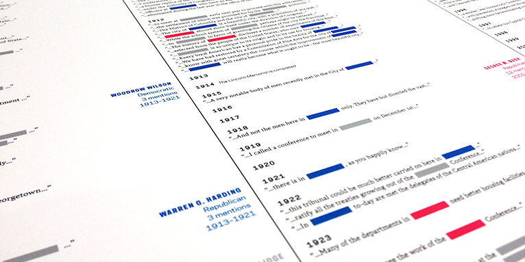
We encouraged the students to create an editorialized view into the content, uncovering interesting stories in the data. Wes programmed a simple search tool to help the students chart and analyze the State of the Union speeches. The tool plots how many times a word of phrase was said by the president during each speech and shows the sentence context of each instance of the word.
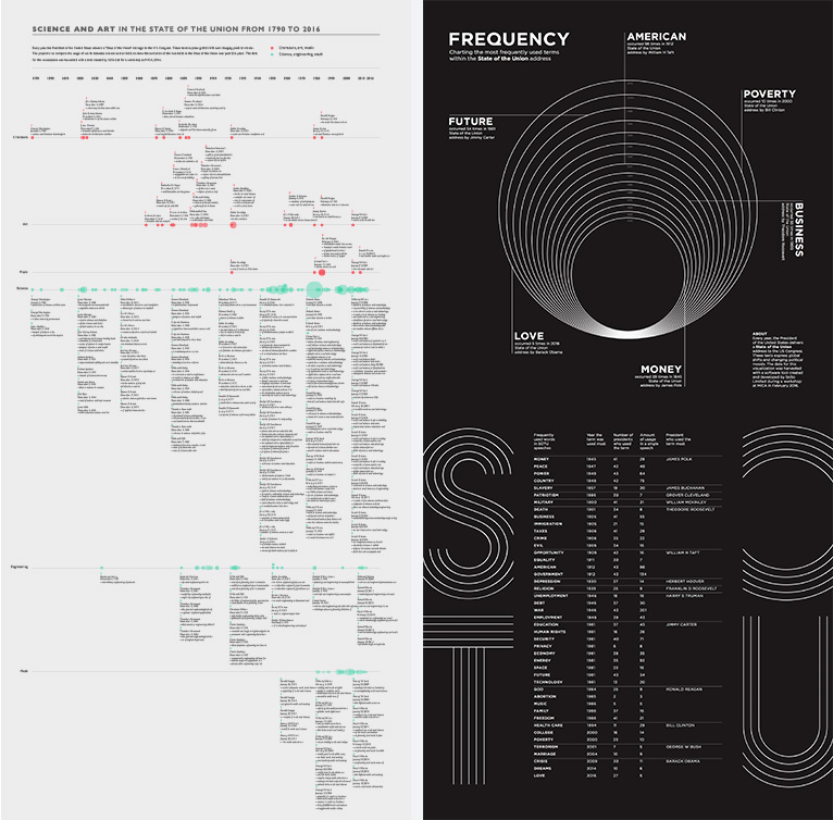
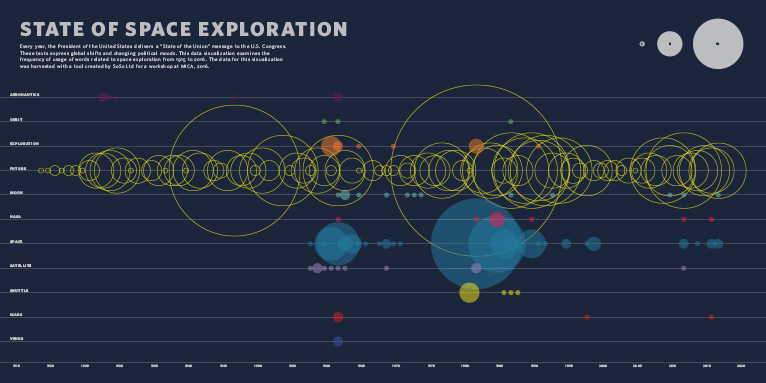
There was a huge amount of variation in the stories the students chose to tell in their posters. Some students looked at the number of times a specific country was mentioned and paired this information with immigration data or legislation. Another student mapped the colors mentioned in each speech and to what they referred, seeing how associations with different colors changed over time. Students translated the text into other languages, analysed the positivity or negativity of the speeches, mashed up the transcripts with song lyrics — producing a set of posters that look at the same information in totally unique ways.
We were blown away by the creative thinking of the student designers in both concept and formal execution of the visualizations. Thanks to Ellen and Jason for inviting us, and major thanks to the GDMFA students for hosting us and defying all of our expectations during the workshop!